An AI-Driven Experiment Challenging the Limits of Aesthetics
"If AI can understand the principles of the immense beauty of design due to its vast knowledge. Could it easily generate the most profoundly anti-aesthetic outcome imaginable that a human mind might never conceive on its own?"
Through this experiment, I aimed to test the boundaries of AI's creative and destructive potentials by guiding it towards the deliberate construction of ugliness.
Goal: Test the outer limits of visual aesthetics by inverting fundamental design principles and seeing how far AI can push "ugly".
Approach:
Identify Core Design Principles, analyze the fundamental pillars of good design:
- Clarity
- Visual Hierarchy
- Contrast
- Balance
- Alignment
- Consistency
- Simplicity
- Accessibility
- Functionality
- Emotional Impact
Deconstruct and Invert Extremes, rather than simply inverting, the goal was to systematically destroy or destabilize these principles.
For example:
100% contrast → 0% contrast (flat visuals)
Harmonious composition → chaotic, unbalanced arrangement
Clear legibility → distorted, blurred, or broken typography
Logical proximity → random spacing and disconnection
Iterative Feedback Loop:
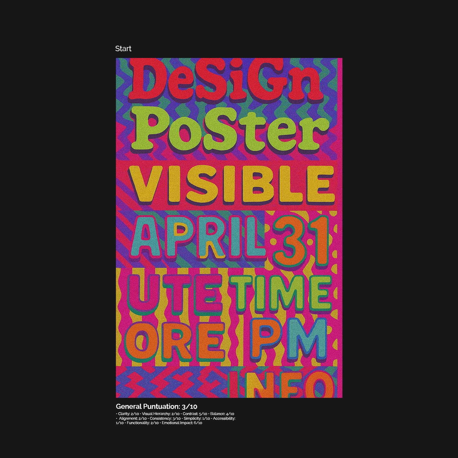
Generate an initial poster via AI prompt:
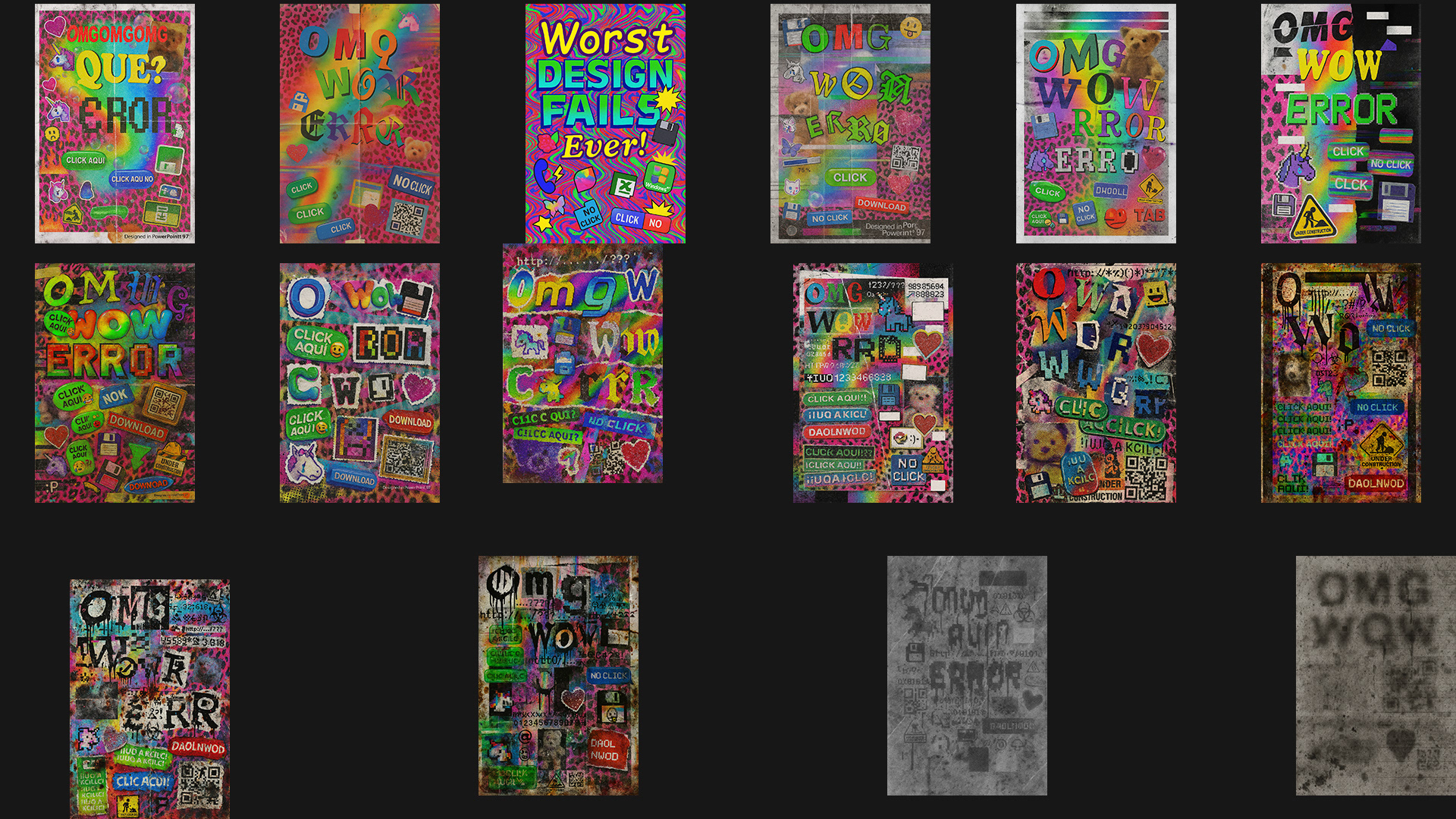
[Generate a poster (1080x1920 proportion) that represents the absolute worst principles of graphic design. Create a visually offensive, highly unpleasant, and inaccessible composition. Intentionally break all key rules of good poster design: Use illegible typography with extremely low contrast. Overcrowd the layout with chaotic, unbalanced elements. Avoid any visual hierarchy; make every element compete equally for attention. Choose clashing, uncomfortable color combinations that hurt the eyes.
[Generate a poster (1080x1920 proportion) that represents the absolute worst principles of graphic design. Create a visually offensive, highly unpleasant, and inaccessible composition. Intentionally break all key rules of good poster design: Use illegible typography with extremely low contrast. Overcrowd the layout with chaotic, unbalanced elements. Avoid any visual hierarchy; make every element compete equally for attention. Choose clashing, uncomfortable color combinations that hurt the eyes.
Apply textures, patterns, and effects aggressively without moderation.Feature the most overused, cliché visual elements often seen in amateur design posters.The goal is to create the most hideous, unreadable, and uncomfortable design possible — an intentional anti-design statement.]
Use a separate LLM to analyze the poster with aesthetic judgment, evaluating the result based on key principles (contrast, hierarchy, legibility, etc.).
Receive structured feedback highlighting areas where the poster was "too good" or "not ugly enough."
Refine and optimize the prompt to degrade aesthetic quality further, pushing the piece into deeper anti-design territory.
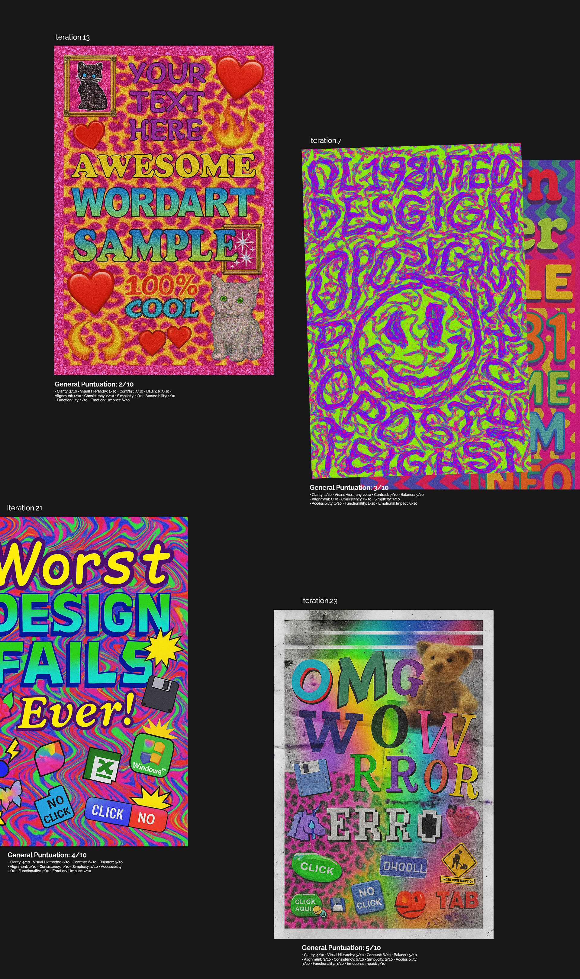
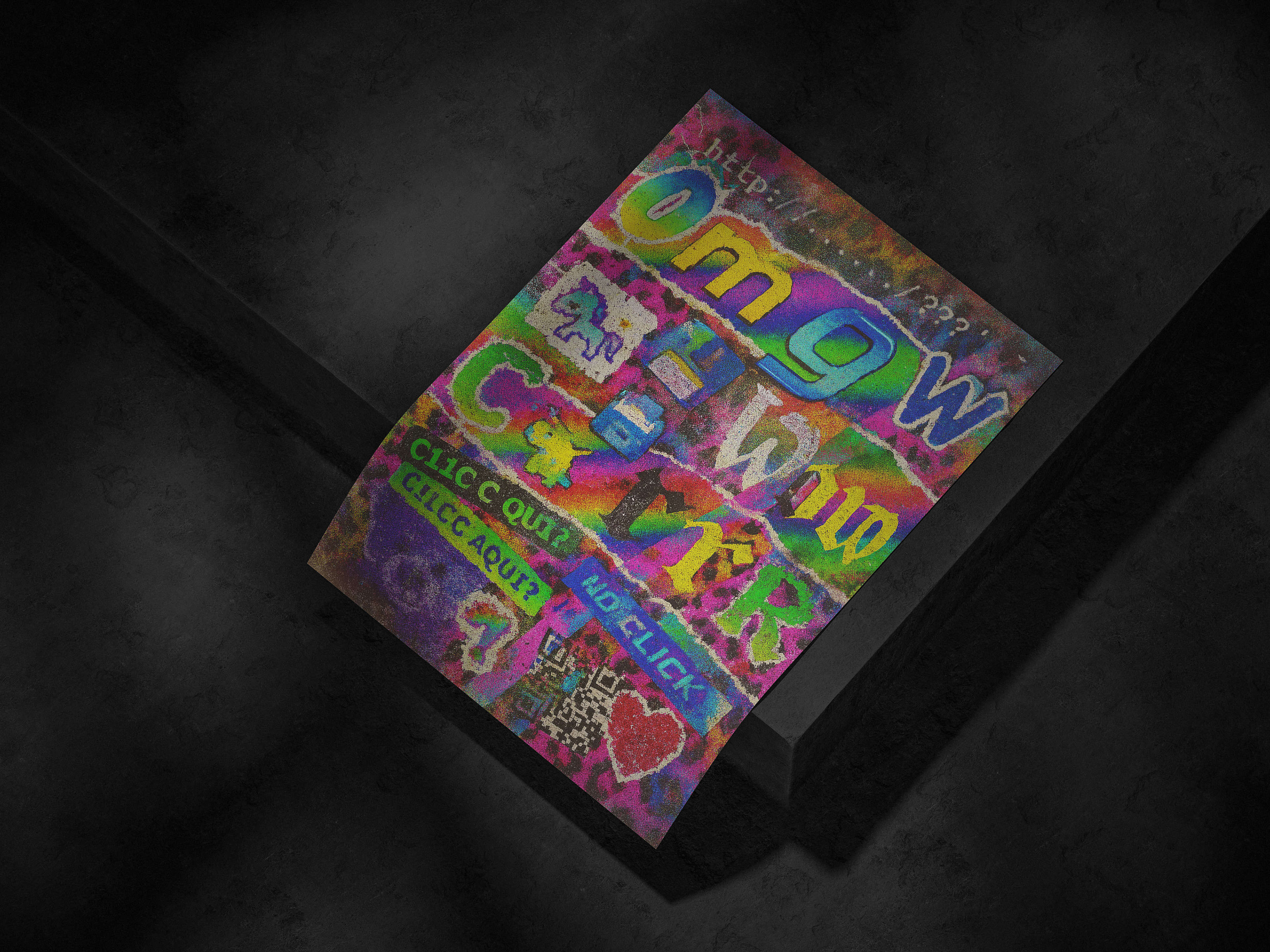
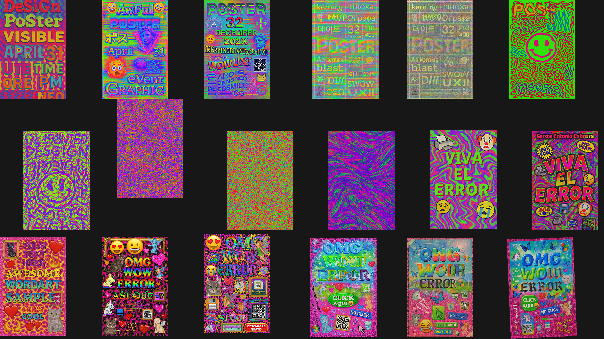
Experimental Iterations:
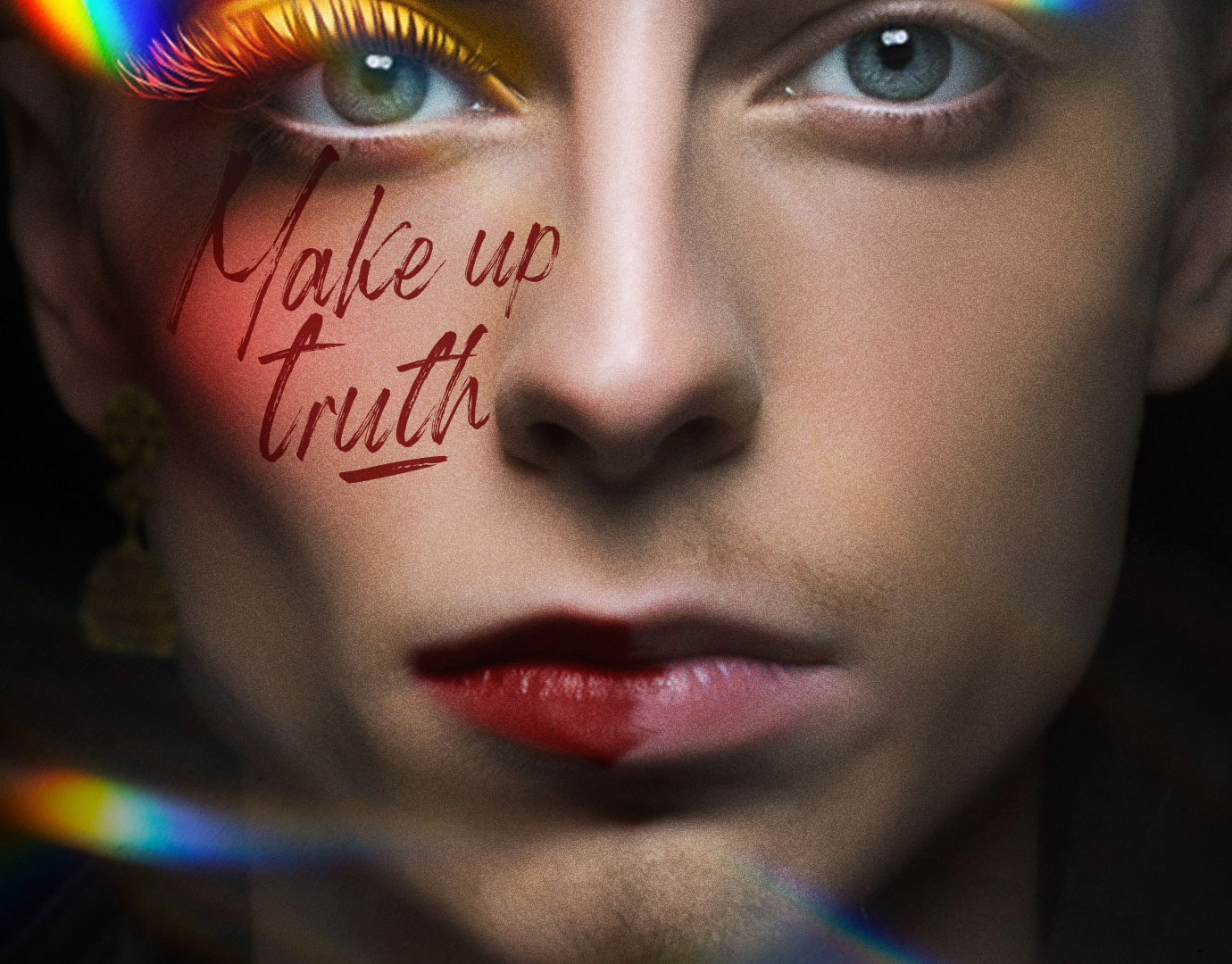
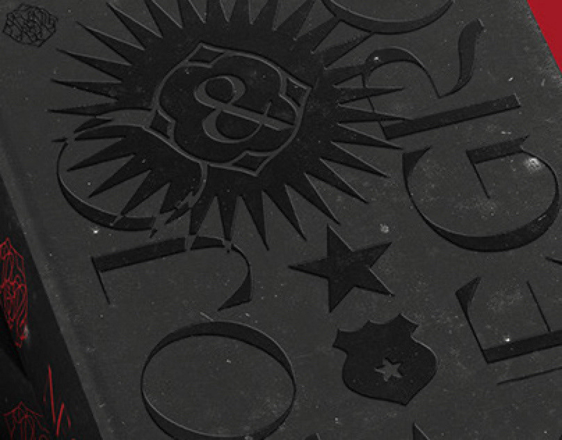
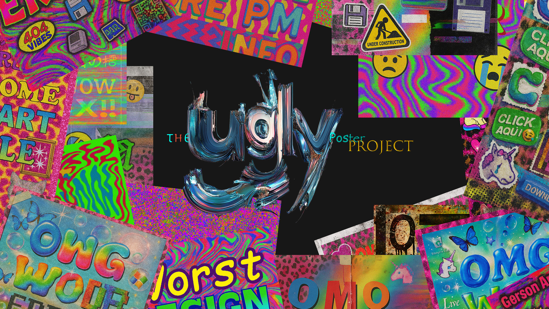
This gallery presents 34 distinct variations, each resulting from a deliberate prompt-analysis-refinement cycle.
This gallery presents 34 distinct variations, each resulting from a deliberate prompt-analysis-refinement cycle.
Through this experiment, I uncovered several unexpected truths about the relationship between Artificial Intelligence and the limits of aesthetic reasoning.
First, while human intuition suggests that "doing something badly" should be easy, the reality is more complex for AI. Despite its vast analytical power and exposure to countless examples of good design, AI struggles to produce something genuinely, intentionally ugly. The effort required to create a truly unpleasant piece is, in many ways, as difficult as creating something perfectly beautiful. Both extremes demand precision, focus, and intentional deviation from learned patterns.
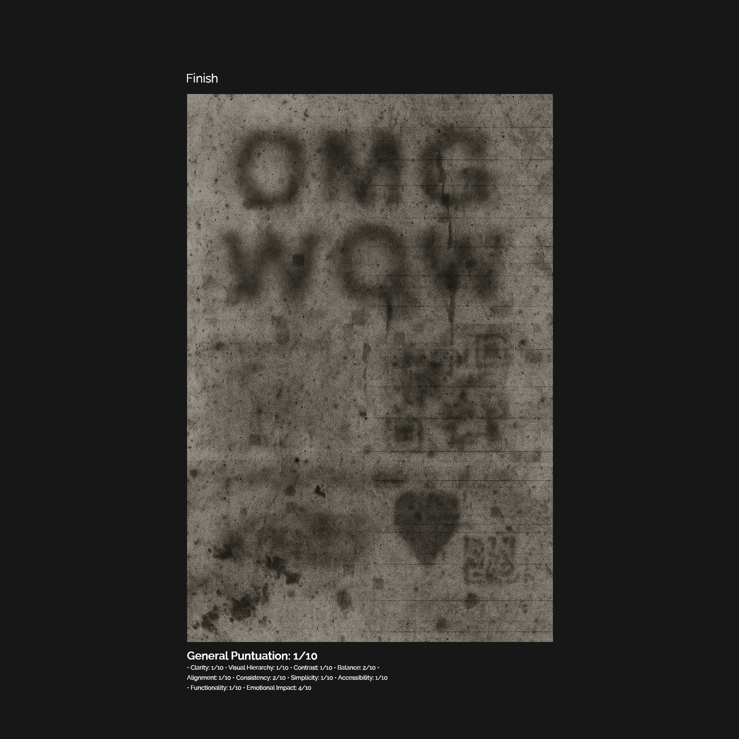
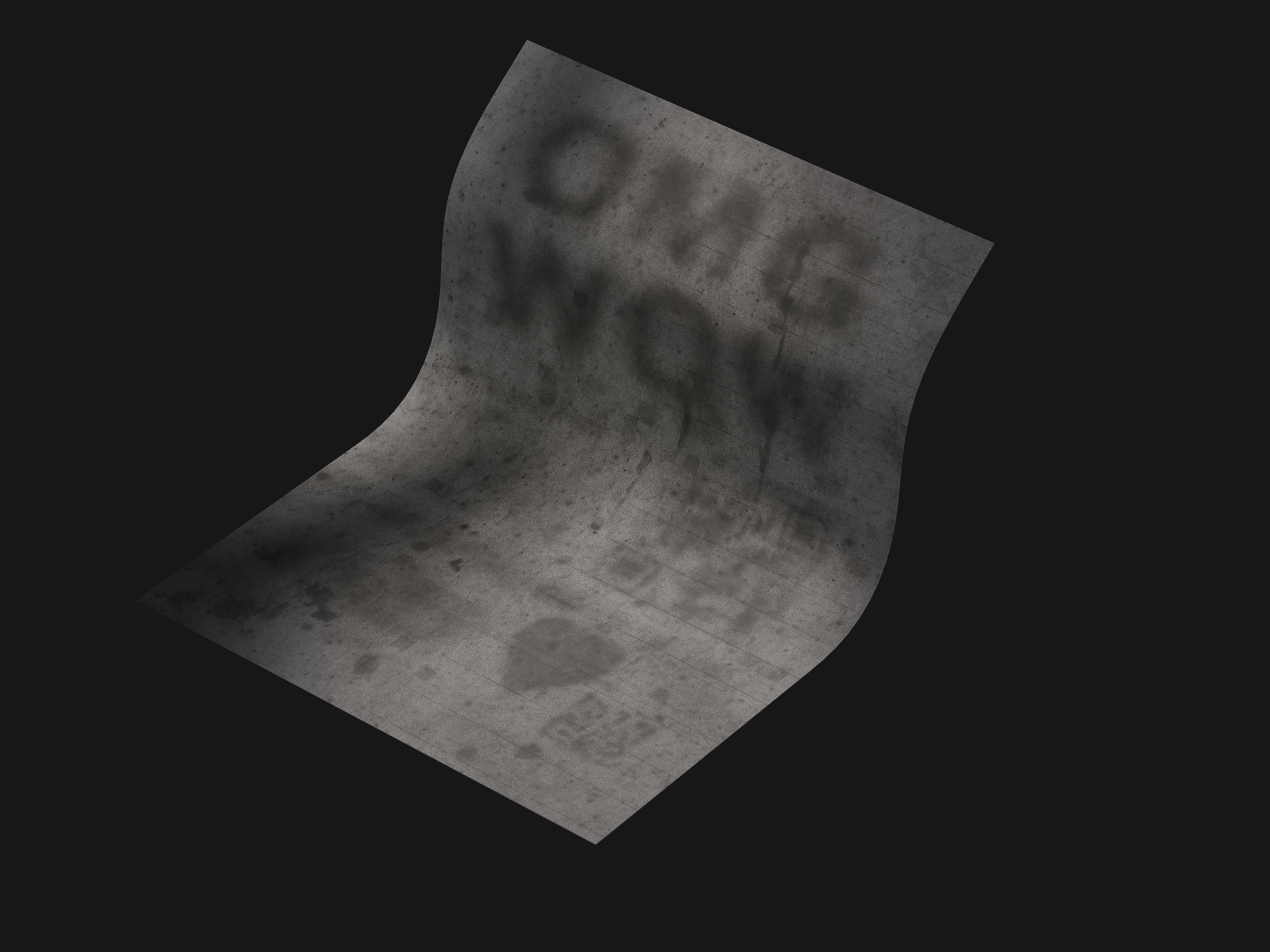
Second, even with systematic deconstruction and deliberate sabotage of design principles, it proved impossible to eliminate all aesthetic value completely. No matter how aggressively the prompts were optimized to break every rule, some elements — tiny fragments of contrast, rhythm, hierarchy, or balance — stubbornly survived. This reveals an underlying truth:
"Nothing can be purely bad or purely good. In every creation, no matter how distorted, some trace of structure, intention, or meaning persists — an unavoidable echo of the imperfect, humanized universe we inhabit."
Ultimately, this project demonstrated that AI, like humanity, operates within constraints of imperfection. It can aim for extremes, but perfection (in beauty or in ugliness) remains elusive, always shaped by hidden biases, patterns, and remnants of its origins.
Not so ugly? You think that you can create an even worse result?
Share yours with the hashtag #TheUglyPosterProject.
Project Details: Date Generated: April 24, 2025. Knowledge based on available models at that time.